We've built hundreds of landing pages over the years, and the ones that perform best all share the same DNA. It's not about flashy animations or trendy layouts — it's about understanding human psychology and designing for action.
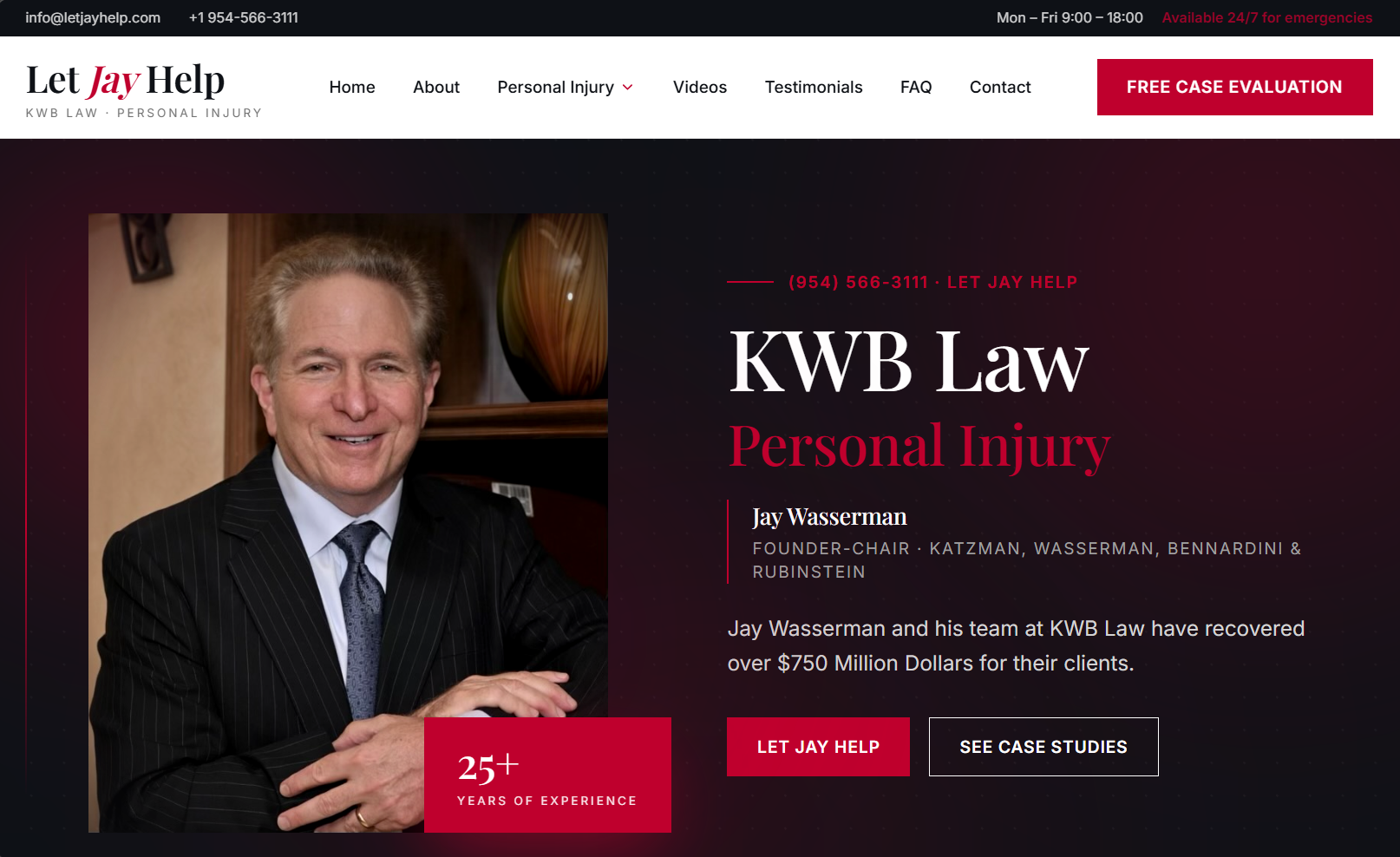
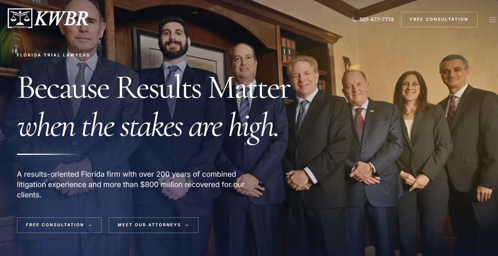
The first element is a clear, benefit-driven headline. You have roughly three seconds to communicate your value proposition before a visitor decides to stay or leave. Your headline should answer one question: "What's in it for me?" Skip the clever wordplay and lead with the outcome your audience cares about.
Next comes social proof. Testimonials, client logos, case study snippets, and metrics all work to reduce friction. People trust other people more than they trust brands. Place your strongest social proof above the fold where it can do the most work.
Your call-to-action is where most pages fall apart. A single, prominent CTA that uses action-oriented language will always outperform a page cluttered with competing options. "Get Your Free Audit" converts better than "Submit" every single time.
Finally, don't underestimate the power of whitespace and visual hierarchy. A clean layout with intentional spacing guides the eye naturally toward your CTA. When everything screams for attention, nothing gets it. The best landing pages feel effortless to navigate — and that's entirely by design.